Showing posts with label design trends. Show all posts

Tuesday, March 4, 2014

Design Trend: Double Exposure

Like most people, I've recently discovered and become obsessed with the HBO show, True Detective. But my love affair began with the mesmerizing opening credits by Elastic production studio. The sequence shows double exposure photos of landscapes captured in silhouetted human forms. Visual metaphors at their best. Now I'm seeing double exposures everywhere:


The work of photographer Dan Mountford has been on my radar for a while. This image in particular is a favorite.


And most recently spotted, this advert for PS4's Thief on 4th Avenue in Brooklyn. Not quite the same level of design-sophistication, but it does speak to the strength of the double exposure trend.


Look for more double exposure coming to YA shelves near you ...

Tuesday, June 18, 2013

Design Trend: Painterly Type

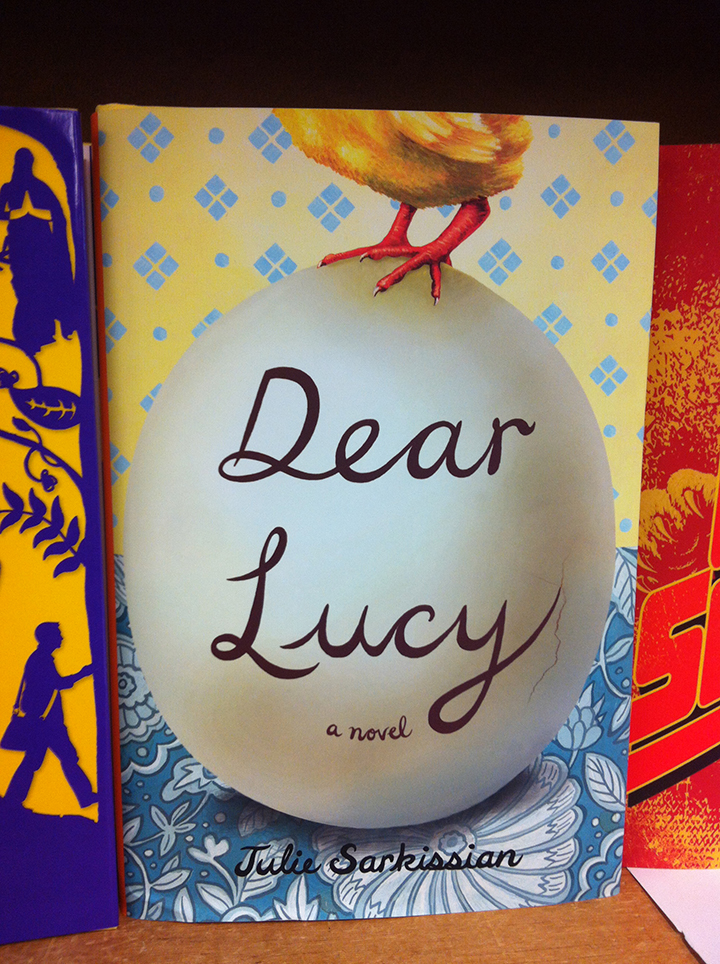
On a recent visit to Powell's Books in Portland, Oregon, I naturally gravitated to the wall of new novel releases. For both Adult and YA, the type treatment of the moment is this painterly, brush-stroke-like hand lettering that's 1) quite large—as in, it takes up most of the cover; 2) a basic color, mainly white or black; and 3) at a slightly left-sloping angle. Some of my favorites:


Which then got the wheels turning and ultimately inspired the final iteration of Lauren Myracle's upcoming YA novel, The Infinite Moment of Us. A complete look at the making of the cover coming next week. Stay tuned!

Tuesday, April 3, 2012

A Book Designer's Meme

A slide from my New York Library Association keynote speech, "Under the Cover: The Art of Children's Book Design." More highlights TK!

Thursday, February 16, 2012

Design Trend: "The Knockout"

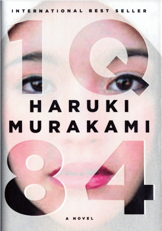
Over the last few months, I've noticed an emerging design trend for both YA and adult novel covers. It's something I like to call, "The Knockout." Essentially an image is clipped out of or partially hidden behind typography, so it's the image that colors in the type. I first noticed it in the original hardcover version of Lauren Oliver's Delirium.


(The jacket has since been redesigned by the talented folks at HarperCollins, but remains a stand out design.)

The K.O. caught my eye again when my local Barnes & Noble did a window display of Haruki Murakami's novel, 1Q84. In this case, the photo is printed on the case and the type is die-cut from a vellum overlay.


After spotting 1Q84, the K.O. concept has been at the front of my radar, so I've started to see it everywhere. From adult fiction:


And back to young adult:


Some covers push the boundaries of the technique by combining graphic elements with the K.O. typography, but the concept is still there.


Anyone who knows me can attest to the fact that I'm a huge type fan and LOVE when well-designed typography is featured prominently. Like any design conceit, The Knockout can make a powerful statement when well executed. And fortunately, it's still a subtle trend and not so ubiquitous that its worn out its welcome.