

(The jacket has since been redesigned by the talented folks at HarperCollins, but remains a stand out design.)
The K.O. caught my eye again when my local Barnes & Noble did a window display of Haruki Murakami's novel, 1Q84. In this case, the photo is printed on the case and the type is die-cut from a vellum overlay.
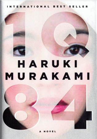
After spotting 1Q84, the K.O. concept has been at the front of my radar, so I've started to see it everywhere. From adult fiction:


And back to young adult:


Some covers push the boundaries of the technique by combining graphic elements with the K.O. typography, but the concept is still there.

Anyone who knows me can attest to the fact that I'm a huge type fan and LOVE when well-designed typography is featured prominently. Like any design conceit, The Knockout can make a powerful statement when well executed. And fortunately, it's still a subtle trend and not so ubiquitous that its worn out its welcome.
Oh my goodness I love knockouts! And here I was thinking I was the only one who'd noticed. The other thing I'm seeing more of is the use of vector art images over stock photos (The Night Circus). When done well, they're amazing, but some are just like--you haven't done this before, have you?
ReplyDelete