Letterpress printing is pretty much what it sounds like: Inked letters (or shapes) that are pressed into the surface of paper, creating a relief or impressed print. It's actually the oldest form of printing, harkening back to Johannes Gutenberg's invention of movable type in the mid-fifteenth-century. Even though letterpress is nearing its 580th birthday, it still remains (in my geeky opinion) one of the most elegant and tactile forms of printing.
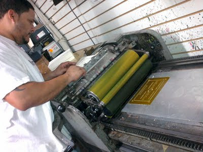
Needless to say, I was very excited that Annie and Renee decided to letterpress their invites and even more excited that I got to go on my first letterpress press check. The letterpress at Print Icon on 18th Street in Manhattan isn't a big machine, but it requires some pretty deft and meticulous skill to operate. Pressman Willie is all of the above, not to mention extremely tolerant of my inquisitive geeking.
So, here's how it works:
In the olden-days of Gutenberg, a press frame was loaded up with individual pieces of wooden type. But today, many modern presses use photo-etched zinc plates. The number of plates is determined by the number of colors being printed. I designed Annie and Renee's invites in two colors, so this is the first plate in our two-color job. Mixing our first color, Pantone Warm Gray 9. Looks exactly like it sounds.
The press is inked and ready to be operated by master pressman, Willie.
Willie hand-feeds each sheet of 110# ivory cover stock through the press.
And this is what the first color looks like:
One-color print and plate:
Cleaning and preparing the press for plate number two.
Mixing our second color: Pantone 110U, a warm yellow-gold.
Yes, it does look an awful lot like something scraped from the bottom of the Gowanus Canal,
but I promise it's just our second PMS color and it will look much better on press.
The second plate is on the press and ready for printing.
Willie calibrating the registration of our second color. This takes a lot of skill and more than a few takes to get everything lined up just right.
And here's the final, perfectly registered, two-color print:
And here's my favorite part: The oh-so-gorgeous, CaslonFiveForty-Italic Oldstyle Face Swash ampersand. A mouthful, but it is delicious!


So cool!! I can understand why you geek out about this--how could you not?!
ReplyDeletethanks, jana!
ReplyDeleteI temporarily took this off my page until we send out the real thing. Once they go out, I will put the link up on my wall. This is amazing.
ReplyDeleteHi :) Can I ask you how the Pantone 110 in the lettering "rendered" in terms of legibility? I am about to print business cards with this color and was wondering if that yellow was very legible or was it hard to read? How big were these invites?
ReplyDeleteTHANKS so much in advance!!
Nice register work. Reminds me of the days when I operated a Chandler & Price letterpress with a Kluge Feeder - the Cadillac of letterpresses. Thanks.
ReplyDeleteI love the design of these invites!
ReplyDelete