

Friday, May 27, 2011
Friday, May 20, 2011
Design geek press check
As a designer, I'm prone to geeking-out over things like typefaces and color and generous page margins and photoshopped effects, etc. So, when my best friend asked me to design her wedding invitations, I said, yes!, and then strongly encouraged the betrothed to consider letterpress printing for two reasons: 1) Because I really, really geek-out over anything letterpress, and 2) It always looks beautiful. Always.
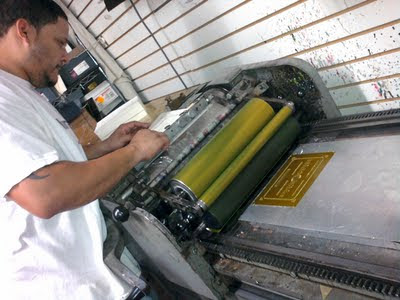
Letterpress printing is pretty much what it sounds like: Inked letters (or shapes) that are pressed into the surface of paper, creating a relief or impressed print. It's actually the oldest form of printing, harkening back to Johannes Gutenberg's invention of movable type in the mid-fifteenth-century. Even though letterpress is nearing its 580th birthday, it still remains (in my geeky opinion) one of the most elegant and tactile forms of printing.
Needless to say, I was very excited that Annie and Renee decided to letterpress their invites and even more excited that I got to go on my first letterpress press check. The letterpress at Print Icon on 18th Street in Manhattan isn't a big machine, but it requires some pretty deft and meticulous skill to operate. Pressman Willie is all of the above, not to mention extremely tolerant of my inquisitive geeking.
So, here's how it works:
In the olden-days of Gutenberg, a press frame was loaded up with individual pieces of wooden type. But today, many modern presses use photo-etched zinc plates. The number of plates is determined by the number of colors being printed. I designed Annie and Renee's invites in two colors, so this is the first plate in our two-color job.
Mixing our first color, Pantone Warm Gray 9. Looks exactly like it sounds.

The press is inked and ready to be operated by master pressman, Willie.

Willie hand-feeds each sheet of 110# ivory cover stock through the press.

And this is what the first color looks like:

One-color print and plate:

Cleaning and preparing the press for plate number two.

Mixing our second color: Pantone 110U, a warm yellow-gold.

Yes, it does look an awful lot like something scraped from the bottom of the Gowanus Canal,
but I promise it's just our second PMS color and it will look much better on press.

The second plate is on the press and ready for printing.

Willie calibrating the registration of our second color. This takes a lot of skill and more than a few takes to get everything lined up just right.

And here's the final, perfectly registered, two-color print:

And here's my favorite part: The oh-so-gorgeous, CaslonFiveForty-Italic Oldstyle Face Swash ampersand. A mouthful, but it is delicious!

Thursday, May 5, 2011
Under the Cover: Shine

One of the best things about being a designer is getting to work on projects that I really care about. Shine by Lauren Myracle is hands-down, without a doubt, one of those projects. The story is raw, gritty, and just plain beautiful—and I knew the cover had to do it justice.
Book Summary
From Amazon.com:When her best guy friend falls victim to a vicious hate crime, sixteen-year-old Cat sets out to discover who in her small town did it. Richly atmospheric, this daring mystery mines the secrets of a tightly knit Southern community and examines the strength of will it takes to go against everyone you know in the name of justice.
Against a backdrop of poverty, clannishness, drugs, and intolerance, Myracle has crafted a harrowing coming-of-age tale couched in a deeply intelligent mystery. Smart, fearless, and compassionate, this is an unforgettable work from a beloved author.
Design Exploration
I read an early draft of the Shine manuscript and immediately had a very vivid picture of the town and its cast of characters. I'm from southern Virginia, so the setting and the people felt very familiar. (Seriously, even things the characters would say, like, "Shit fire and save bullets!" were common expressions in my upbringing.) So I used that sense of nostalgia to compile imagery that felt appropriate for Shine.Inspiration
I'm a fan of the HBO show, True Blood, so the opening credits instantly popped into my head as evoking that kind of gritty, southern energy.


This last image in particular was sort of a muse for the design direction. It just feels like the South—weathered and beautiful and a little unsettling. Other stock photography and the work of North Carolina photographer Sterling E. Stevens also lent inspiration:


Cover Creation
When I started designing this cover, the title of the book was Speechless. The design angle being how Cat was silenced by a terrible childhood event. A very early comp looked like this:
But (thankfully!) we didn't stay with this direction long. We decided it was more important to focus on how Cat was emerging from her fearful silence and blossoming into a strong young woman. Going back to my inspiration board and childhood memories of magnolia trees and rust covered sheds, the design went in this direction:

And got a lot of positive reaction. The strongest element was the magnolia blossom—sort of a diamond in the rough—so I continued with that imagery.


When the title of Speechless became Shine, I knew the cover needed to be less about receding and more about emerging and the struggle of becoming. There's a powerful scene at the end of the book that involves water:


And another with a mourning cloak butterfly caught in a spider's web:

But what these comps were missing was hope. The struggle was evident enough, but ultimately, Shine is a story of hope and compassion and leaping off the edge of doubt.

And blooming in the face of adversity.

As with most things, this design came full circle and ended where it began—which was with this early comp. Something about this flower blooming in spite of everything, spoke most to Cat's struggle and her cause for hope.

Using several stock photos and off-centered Gor Light title type, I layered the cover together, piece by piece ...


Until I got this:

Add one very fantastic sculptural emboss (courtesy of our very skilled printer, Lehigh Phoenix):

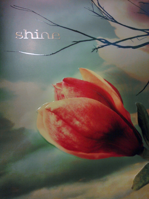
And the case foil stamp seals the deal.

Other Shine reads and reviews:
Los Angeles Times
Goodreads.com
YA Litwit
Book Page
YA Lit Crave
Into the Morning Reads
Subscribe to:
Posts (Atom)